Timeless Decor Simply Never Goes Out of Style
I just had the pleasure of going to Westerly Rhode Island this past week for some rest and relaxation and I can honestly say that I came home more inspired than ever. We stayed in a beautiful bed and breakfast called the Margin Street Inn where I witnessed the true beauty of timeless decor.
Just as a black turtleneck or cashmere wrap coat will never seem dated, the decor at the Margin Street Inn gave off the same vibes.
Regardless of your particular taste, there’s something so comforting in being surrounded by excellent taste. I’ll share some of the secrets I saw while staying there and visiting the main property that the owner, Sarah Cooper, graciously allowed me to peruse.
Continuity of Color & Design
Many of the walls in the main house were similar in color, but the striking thing to me was that if you were in a room that had a lot of blue in it, the room next to it would have some blue in it as well. It doesn't have to replicate the previous room (and shouldn’t in most cases), but by bringing in color from one room to the other, it complements each space.
In fabrics, area rugs and in wallpaper were reflective of continuous patterns. Some may be more dense (wallpapers and fabrics) than others, but the ongoing continuity of designs keeps your eye moving and connects rooms to one another.
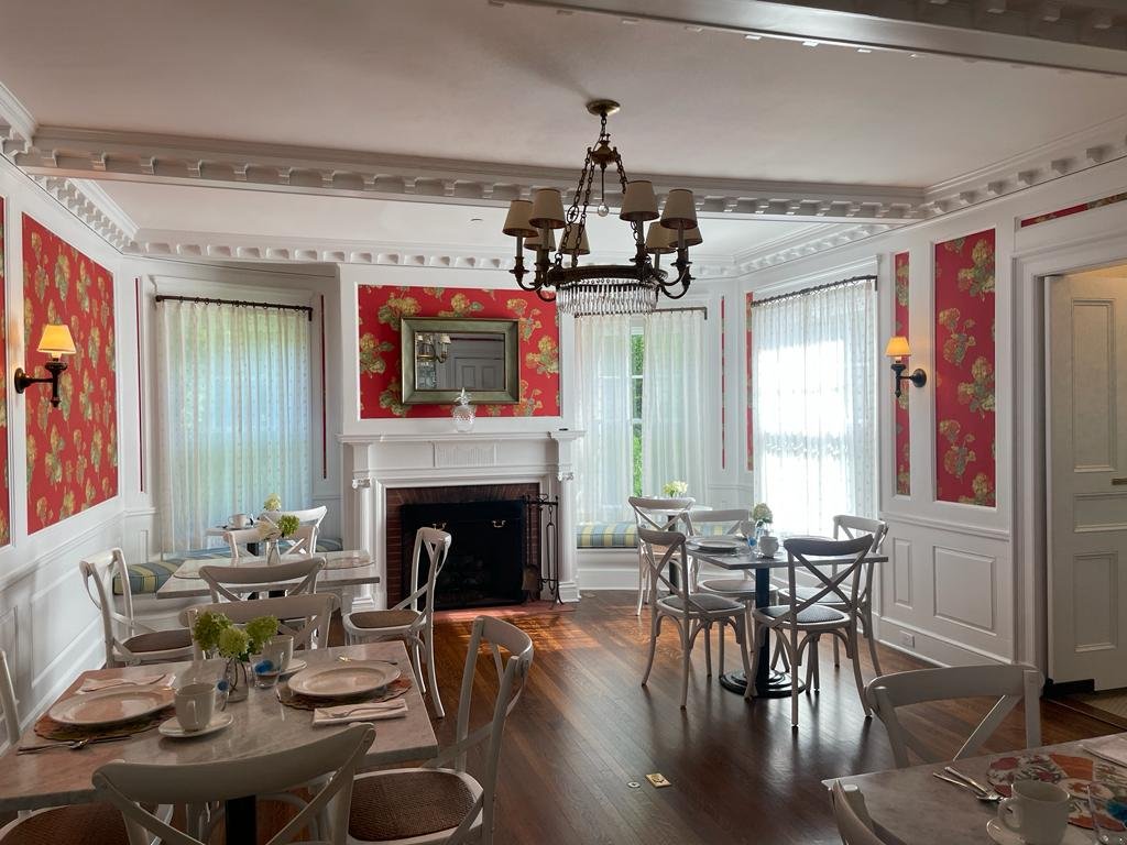
See the bright red wallpaper in some areas of the breakfast room and the room next to it, is primarily blue but two chairs with red in them lead you to the eating area.
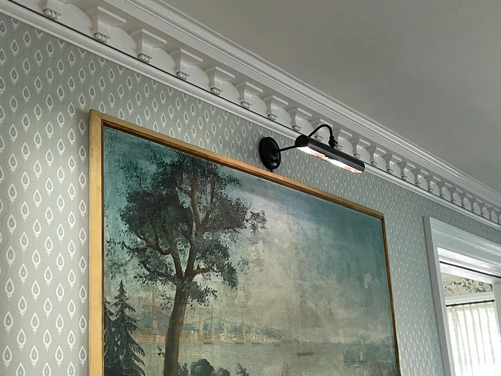
The same is true in the room leading to the breakfast room, with the room perpendicular (or next to) that room with more blue in different patterns. If you continue to the next room, an original green chandelier dictates that green will be used in that room with a gorgeous blue and green wallpaper among other elements of these two colors. Rooms flow one into the other and have a stronger connection when decorated like this.
Classic Materials
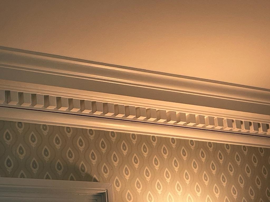
Choosing materials that reflect the style of your home is another great way to keep it looking and feeling timeless. It’s no surprise that I love amazing crown molding and the Margin Street Inn had plenty to choose from. Sarah told me that the home was built in 1840 but around 1880 is when the moldings were installed. Look at these and tell me they don’t stand out and are one of the many aspects that make the room.
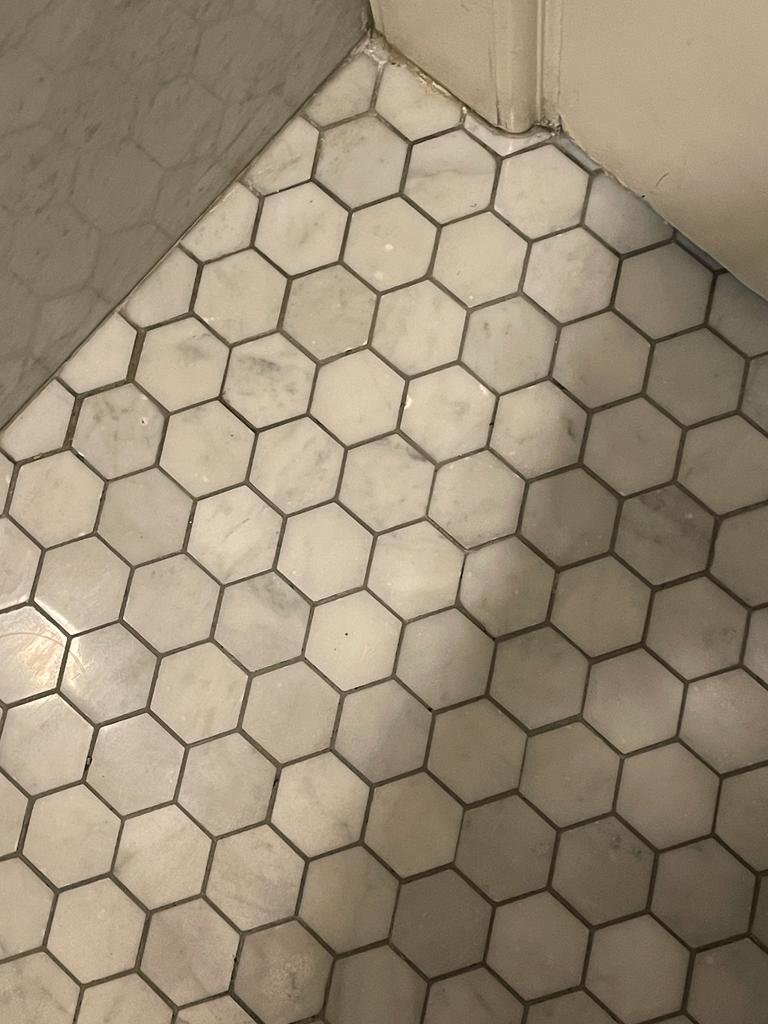
Other classics are subway tile, marble, hexagon marble or porcelain tile and of course black and white tile. With the exception of the marble, these other options are reasonably priced and will never look dated.
I also love the bead board with the thicker top capping that beefs it up and gives it a more substantial look and feel. Don’t get me started on board and batten wall moldings either. Such a great way to elevate a space.
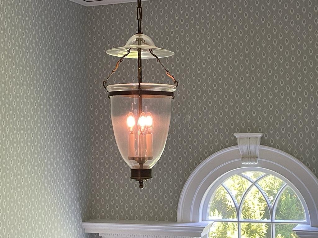
Attempting to maintain items from an older home that fit your space is an added and cost-effective benefit. Look at these light fixtures and even the old fashioned soap and glass holder. Love.
Symmetry
I can’t say enough about how much a space feels more balanced, cohesive and intentional than symmetry. Even when you don’t have a perfectly symmetrical area (for example, a wider bookcase on one side of a fireplace), you can still provide that illusion by putting a chair and ottoman on the side with a smaller bookcase. Visually, it balances the space and feels more welcoming.
Hopefully if you like this kind of design (which can be incorporated into very contemporary homes as well), you can start to make some big or small changes to achieve the flow, beauty and timeless design that this kind of decor can offer.
Stylishly yours,
Nancy
Facebook:https://www.facebook.com/nancymichaelsinteriors/
IG: https://www.instagram.com/nancymichaelsinteriors/

