Classic Trends to Stick and Stay With
Toile wallpaper image source Decor Pad
This sounds like an oxymoron right? If something’s classic how can it be a trend? Like fashion, the same can be true in home decor -- what’s old is new again!
Personally, I love paying homage to history. When I first began my journey into learning about home decor and design I visited countless show homes, historical properties, museums and on and on. The huge benefit for me was that I got a great education and gained a newfound appreciation of the many ways history got so many things right!
Here are a few classic decorating “trends” that I love to consider in my work with clients.
Wallpaper
What can I say but I am loving using wallpaper these days! Just. Love. It. In fact I’m so wallpaper obsessed that after doing my tiny entry in my Beacon Hill condo, I want to do more of it! There’s something about the warmth that it brings to a space that draws you in.
Historically, wallpaper with continuous patterns (without a lot of blank space) works well because it keeps your eyes engaged. Classic patterns like toile, fret, chinoiserie, grass cloth, trellis and even polka dots work well in so many spaces. I used Farrow & Ball Wisteria in my entryway and I could not be happier. The continuous floral pattern has dimension and the color scheme is soothing. Exactly the way I want to welcome my guests.
Architectural Interest
I’m talking about moldings (ceiling, wainscoting, picture framing, fret work on ceilings, medallions on ceilings, etc.). Typically found in historical architecture and buildings -- it’s not often you see it now. In new construction, it almost never is seen unless you want it and are willing to pay the price. It can be added. Although I live in a very historical building (circa 1890) they must have removed much of the character that was no doubt originally there. I added some -- primarily the egg and dart ceiling moulding throughout my unit and I’m so glad I did. It can be easily added to inject more character and warmth to any room. Here’s a trick. If you have low baseboards or existing ceiling molding -- simply move up or down (respectively) a few inches on the wall with a simple half round molding you can get at any home improvement store. Paint it the same color as the existing baseboard or ceiling molding and the space between to give the illusion of a beefier molding.
White wainscoting image source @intrimgroup
Patterns & Colors
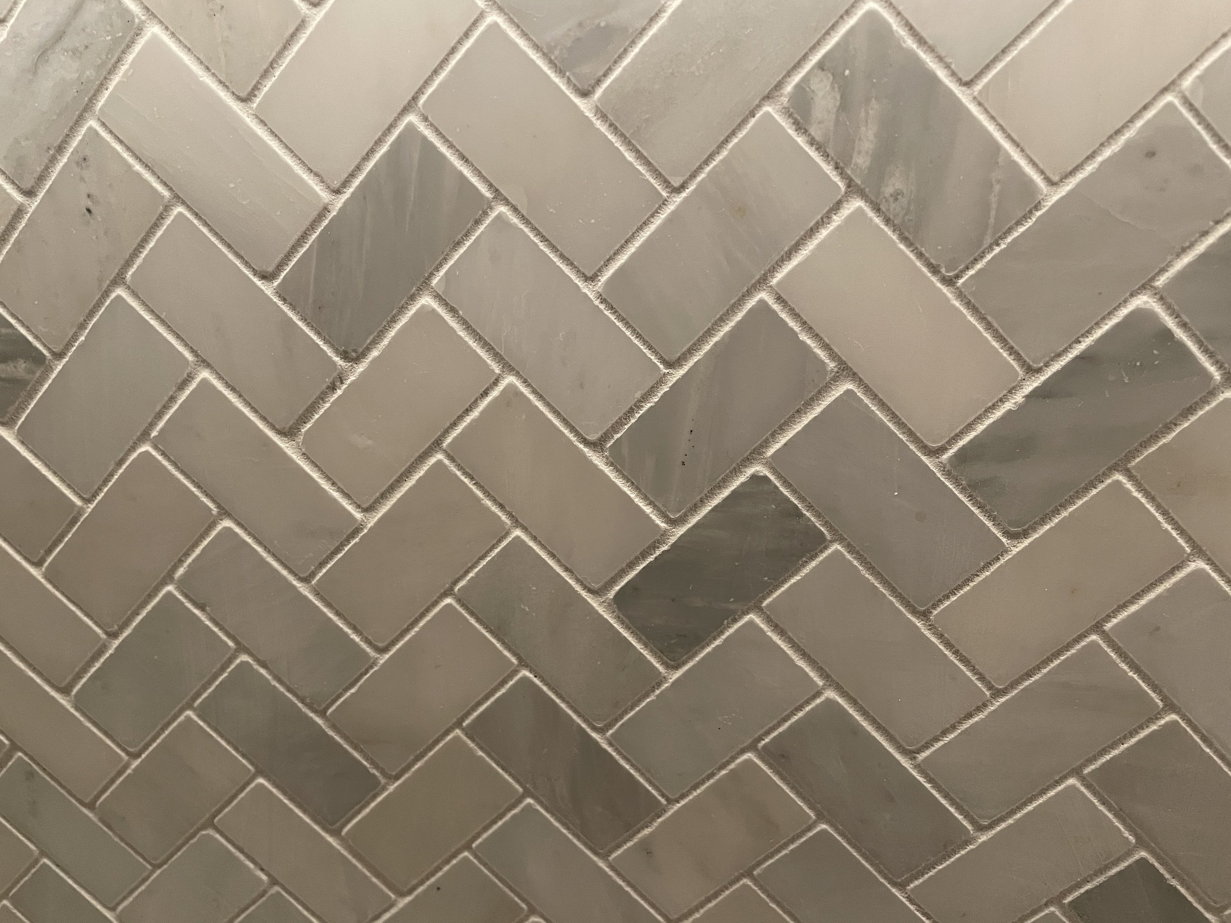
What can I say but I am loving using wallpaper these days! Just. Love. It. In fact I’m so wallpaper obsessed that after beautiful option. You can lay it out in the classic way or do a herringbone pattern, etc. Hexagon tile is also a classic and comes in so many colors and textures now -- what can I say? Basketweave is another example I love to bring into my decor.
Never forget the classic black and white tile. In checkerboard layout, penny tile or custom design layouts -- black and white would be the two colors I’d use if I only had two colors to choose from! Love. Them. They are never a mistake. My suggestion is almost always to go neutral with big items like wall colors, major pieces of furniture, appliances, etc. You can always add your personality with other items like carpeting (I find color on carpeting to be classic and grounding), toss pillows, throws, plants, wall art, etc. That’s where you can add a lot of personality and personalization to your home and if you should change your mind and move from a blue to green phase -- those items are more affordable to replace.
Neutral tiles in a herringbone pattern.
Herringbone bathroom tile image source Pinterest
Miscellaneous Ideas
Here’s a list of some other design concepts that are classic and hence always in style:
Symmetry
Proportion
Function
Balance
Beauty
Loving your home’s interior space is more important than ever. Contact Nancy at nmichaels@nancymichaelsinteriors.com if you would like to schedule a 20 minute virtual consultation to discuss how she can help you fall in love again with your home.


